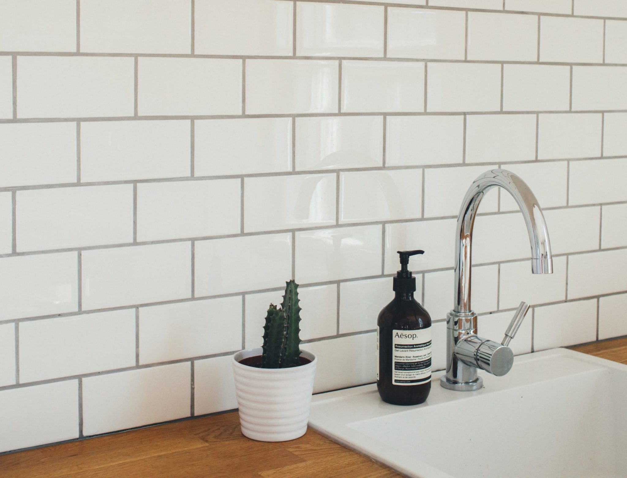
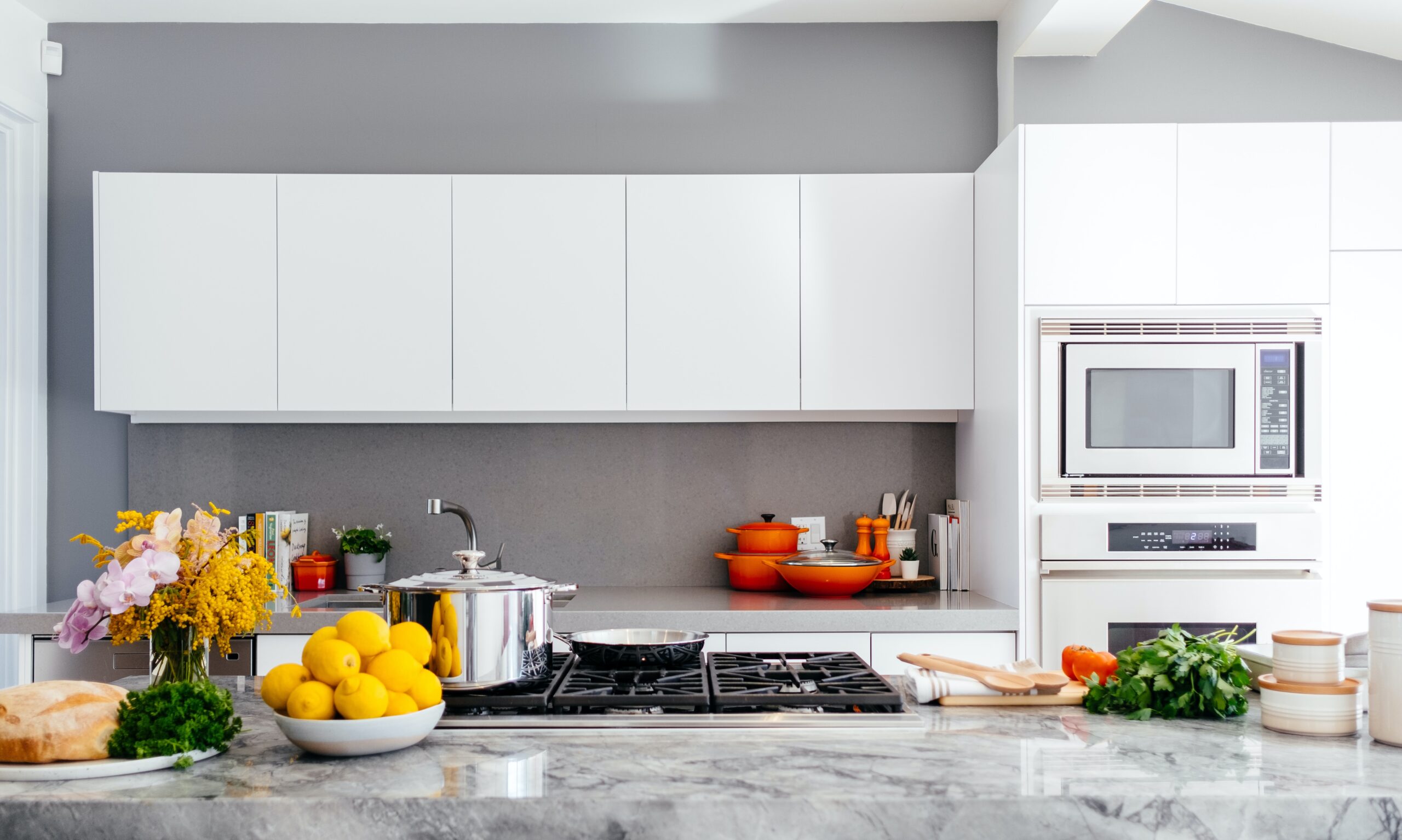
Tile is both a practical and striking design element that can make a statement on floors, backsplashes, and in bathrooms. Many people think picking the tile is the hard part, but our custom home builders find that most clients struggle with grout color the most. Tile grout is an essential part of any tile installation. It holds the tiles in place, helps waterproof the area, and gives a finished look.
The right grout color can make or break any tile installation so here are a few professional tips for selecting the right color!
Use Similar Color for Unified Look
One of the most common tips for picking grout color is to use the same color as the tile. This works best for solid colored tiles. In bathrooms, you’ll often see white tile and white grout. Using a similar color grout allows the grout lines to disappear and blend into the tile, creating a unified look. This is a good design choice if you have a busy tile or if you don’t want the tile to stand out.
Contrast Is Bold But Requires Additional Work
Instead of using a similar color grout, you can also go for contrast by using a lighter or darker grout. For example, it’s common to see a white subway tile with dark gray grout. This is a more bold design choice, however, it takes additional money and work to make it look good. Contrasting grout is a busier look, and it also highlights all of the grout lines meaning they need to be perfect!
Think About Longevity
White grout is super common in kitchens and bathrooms, but people tend to forget that white stains easily. How often have you seen mold or stains in white grout? It’s hard to avoid it. If you opt for white grout make sure you’re ready for the maintenance. If you want to use a similar grout color but don’t want to take the white plunge consider a light gray or beige. It will be light enough to still blend in but won’t stain as easily.
Take Pattern into Consideration
Tiles can make bold design statements. Tile comes in tons of fun shapes such as subway, square, linear, hexagon, etc. Grout can either mute these patterns or highlight it. If you have a fun hexagonal backsplash you may want to use a slightly contrasting grout to highlight it. However, make sure that you don’t have too many other patterns in the space as it can make it too busy.
Don’t Select it in a Vacuum
One of the biggest design mistakes people make is selecting elements without considering everything else around it. Maybe you want to go for a contrast look by using a dark grout with your white tile as a backsplash. This can be a great look, but if you already have busy countertops and flooring adding another strong element can be too overwhelming. Or maybe you want to go with a light grey grout, but all of your other elements are warmer tones like beiges. This will clash and make the tile feel out of place. Always remember to take other elements into consideration when making design choices.
Ready to start building your dream home? Contact us today!


