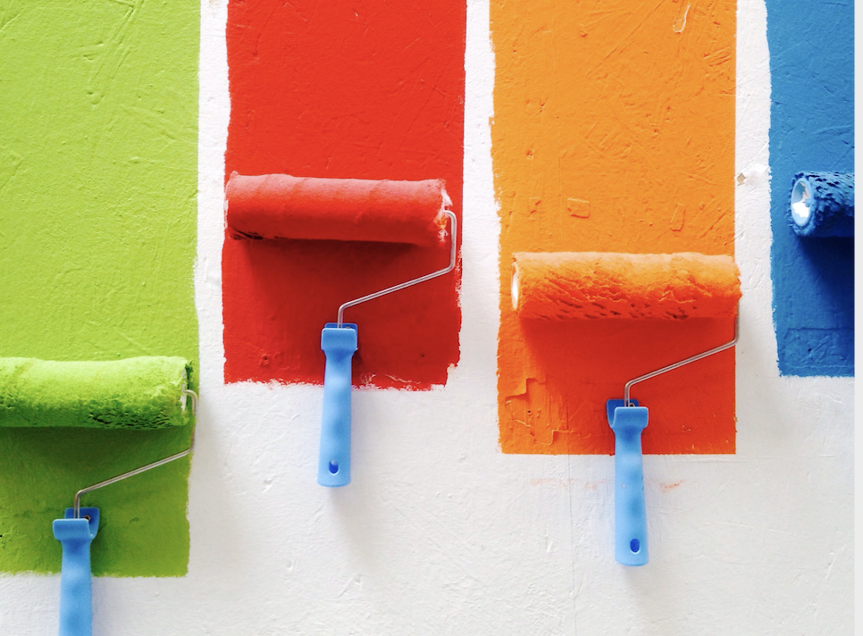
Did you know color plays a role in how we think and feel? Here is a brief intro to color psychology to help you design your custom home!
As a custom home builder, we know there are a lot of decisions that go into designing a home. From layout to materials, there is a lot to select. One important aspect that plays a huge role in how a home functions and makes you feel is color. Whether you opt for a home full of neutrals or use bold colors, the color will play a big role in how your home looks.
Color actually has a psychological value. The colors around us can influence how we think and feel, which is why it’s so important to think about which ones you use in your home. To help you decide the mood you’re going for, here is a brief intro to color psychology!
Red
Red is a bold color that infuses a room with energy. It’s the most intense color that will get your adrenaline pumping. It’s a great choice for a room that you want to bring people together and stimulate conversation in. However, it can also be too overstimulating in the wrong spaces. Red is also known to stimulate appetite, which is why so many food brands use the color.
Red works great in dining rooms and kitchens unless you’re trying to watch your weight! It can also make a powerful first impression in an entryway, and red front doors are considered lucky in some cultures. You’ll probably want to avoid using it in a bedroom though as it can be too overstimulating for sleep.
Red Means: Passionate, active, exciting, bold, youthful, confidence, ambition, power, sensual
Orange
Orange is an energetic color that evokes excitement and enthusiasm. It’s a bold and uncommon color to use in a home. The bright color brings an optimistic and motivating energy to a room. It can also promote social interactions. However, the eye-catching color can be a bit too much for many rooms in the home.
Since it’s such a high-energy color, orange is the perfect choice for a workout room. It will bring you the energy you need to get through your workout. More muted tones also bring wonderful warmth to living spaces, making them feel cozy and inviting. It’s probably best to avoid bright orange in more calming spaces of the home like bedrooms.
Orange Means: Warmth, optimism, freedom, impulse, motivation, youth, innovation
Yellow
Yellow is a vibrant, warm color that people can’t help but feel happy around. This color oozes happiness and sunshine. It’s the perfect color to use in places where you want to energize and uplift. Despite the boldness of this color, it’s a great choice for almost any room in a home depending on the shade. Despite the joy this color brings, it can also heighten negative emotions. Studies have shown people get angrier quicker in yellow rooms and babies are known to cry more.
Yellow is a great color to use in the kitchen or dining room since it’s both warm and known to promote appetite. It can also make entryways feel welcoming and expansive. Certain shades are also cozy and warm, making them great for living rooms and bedrooms. Yellow is known to stimulate the nerves in the body, meaning negative emotions get heightened as well as positive ones so you should use this color in moderation.
Yellow Means: Happiness, warmth, optimism, hunger, intensity, laughter, anxiety, creativity
Green
Green is actually considered the most restful color for the eye, making it one of the most soothing colors you can use in a home. This color is suited for almost any room in the home. It is a calming color that promotes warmth and togetherness. It also emulated nature, making it a great color if you want to bring the outside in.
Green is a great stress relief color, making it well suited for almost any room in a home. It’s perfect for bedrooms, kitchens, living rooms, and more. Green is the color for concentration making it a great choice for offices as well!
Green Means: Calmness, balance, growth, compassion, clarity, sanctuary, safety, nature
Blue
Blue is another calming color that is known to bring down blood pressure and slow down the heart rate. This color is considered calming, relaxing, and serene. However, the energy of this color depends on the shade used. Pastel blues can read infantile and cold, while darker navies can read too severe and sad for certain areas of a home.
Overall though, blue is a great color that promotes openness and calmness. Softer, warmer blues are perfect for bedrooms or bathrooms. Darker, more sophisticated shades such as navy are great for offices or formal living rooms.
Blue Means: Calming, openness, control, content, ambition, loyalty, peace, success, authority
Purple
Purple is a bold, creative color that will pop in any custom home. Richer, darker shades can read dramatic and sophisticated, while lighter shades can be just as calming as blues and greens. This color has been associated with luxury and creativity for centuries, but it is a bold choice that may read too childish in certain rooms of a home.
Darker purples are a great choice for creative rooms such as offices, playrooms, or even kitchens. Lighter shades are more calming, making them great for living rooms, bedrooms, and bathrooms.
Purple Means: Creativity, calming, originality, fantasy, sophistication, luxury, sensual
Final Thoughts
Who knew color could play such a big role in the energy for a room. Selecting color can be a daunting task, but once you understand the psychology behind it the task becomes a bit easier. You can also check out our tips for selecting a home color palette to help you out!
If you’re ready to start building your dream custom home, contact us today! We’re one of the best custom home builders and residential developers in Toronto and the GTA.


